


💡 Every map tells a story
💡 Every map tells a story
Lenses on place, from the political to the ecological


I left a short review on Goodreads for Walden. I gave it two stars because Thoreau isn't around to feel bad about it. Sure, there are a few beautifully written passages, trapped amid so much dross that one might speculate they were accidental. Starting September 10, 2023, I'll pull out only the best passages and consider what they have to tell us about our present-day environmental woes and hopes.
“The Original Instructions . . . are like a compass: they provide an orientation but not a map. The work of living is creating that map for yourself. How to follow the Original Instructions will be different for each of us and different for every era.” ~ Robin Wall Kimmerer, Braiding Sweetgrass, pg.7
My students are working on telling the story of their home watershed, starting with research to find and create layers of maps. Why have architecture students do this, when they’re eager to learn about eco-friendly materials and net-zero buildings? Because it’s far too easy to retreat into abstraction behind a computer screen where living beings are reduced to site plans that delineate tree canopies and stormwater runoff. I want to impress on them that any project they will ever work on is located in a physical place with hidden histories that is home to many species and subject to the whims and laws of possibly multiple jurisdictions.
Most people don’t think about the watershed where they live, but it’s a lovely way to feel more at home in a place. Next week, I’ll invite you to discover and explore your own home watershed. For today, I want to talk about the stories that maps tell because maps, as
regularly reminds us, are amazing. Specific to ecology and global change, ’s recent post turns up many fascinating resources, including maps.1Until this summer’s practice move to Annapolis, I lived for many years in the Jones Falls watershed. Baltimore was well-planned by the Olmsted firm, designers of Central and Prospect Parks, the Emerald Necklace in Boston, a couple dozen college campuses, and beloved parks in cities as far-flung as Scranton, Lexington, Detroit, Chicago, even Montreal. The Olmsteds had the good sense to design Baltimore’s parks along the stream valleys, green gems that protect the streams, house wildlife and serve thousands of residents for recreation and connection to other parts of the city.
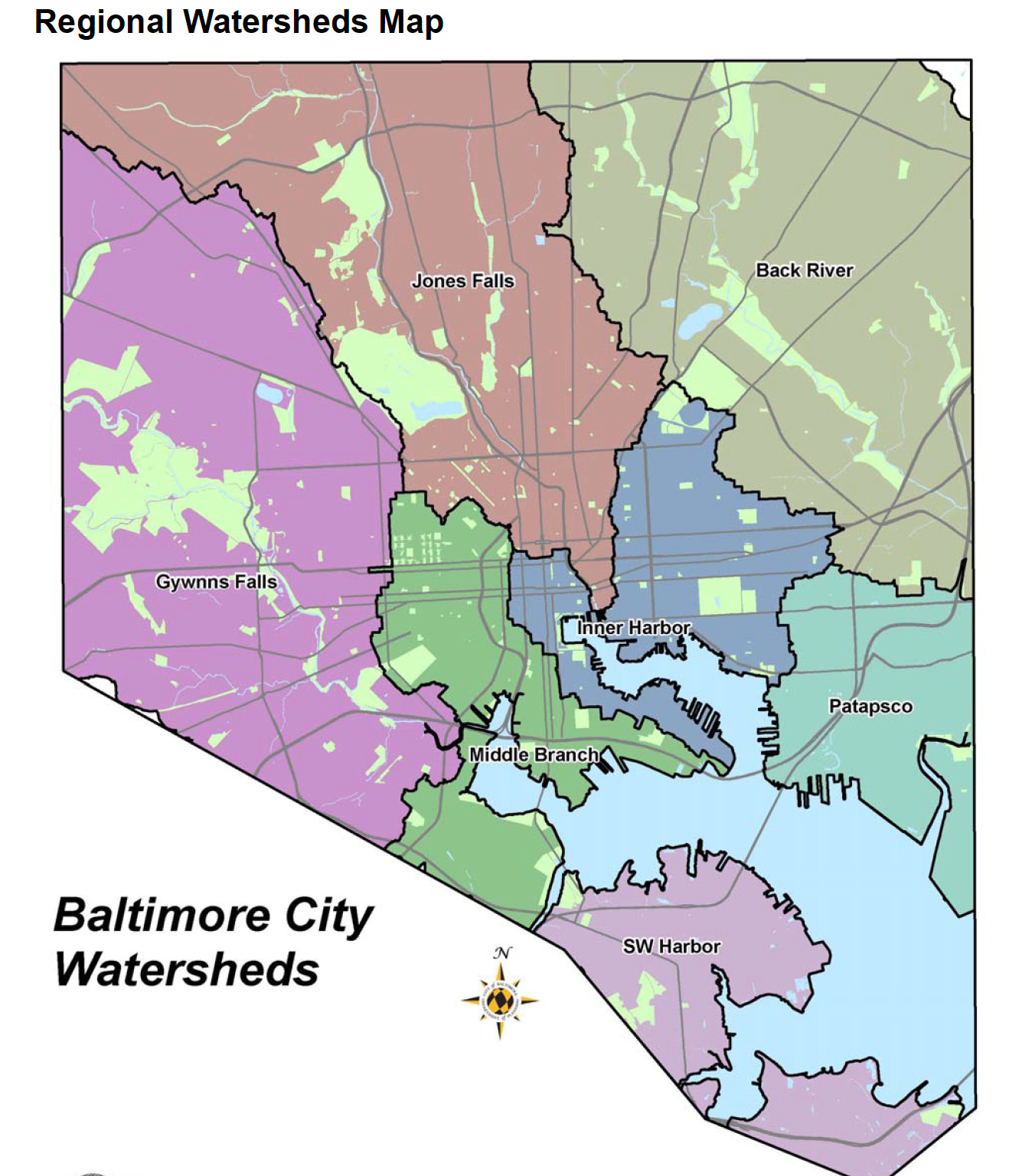
Just south of my home, the Jones Falls valley is dotted with mills, 19th-century brick and stone and heavy timber buildings that are becoming loft apartments, artist studios, co-working offices and food halls. It’s also the location of the hideous but convenient “JFX,” our name for the Jones Falls Expressway that a bunch of suits back in the ‘60s decided was a good idea to build right over top of a stream that was just minding its own business.

In Annapolis, I live near Back Creek, which is in the Whitehall Creek-Severn River-Chesapeake Bay watershed. Nearly the entire watershed is coded red for impaired on the EPA website2. More about that next week, but if maps tell stories, this is a pretty sad / alarming / not surprising one.

Thanks for reading. If you like what you see here, please share and keep in touch.
I always encourage my students to use this searchable, interactive Native Lands map to research their home places3. It’s designed and maintained by Native artists, activists, anthropologists, professors, teachers, decolonizers and computer nerds. Just input an address to discover who lived in the place where you live now, before the settlers came and did their worst. It includes a blog, teaching guides and other resources. Best of all, it makes the point that indigenous people are still living, working, teaching and learning in all those places, now, today.

These next maps are a brilliant way to reconsider how we in the U.S. tell stories about our politics. These are from a blog post by Mark Newman, of the Department of Physics and Center for the Study of Complex Systems at University of Michigan, that he generously licensed under Creative Commons4. He uses the 2016 U.S. election to illustrate the wider possibilities currently overlooked by the storytellers. These show that the vaunted “political divide” may generate clicks, but is actually a far more nuanced story.

This one is the classic vote map by state, which, in terms of sheer geographic area, makes it seem like a no-brainer that the red states elected the president that year. (One detail to remember is that the “blue” candidate did receive nearly 3 million more votes overall.)

The county-level results can tell a different story. As Newman says, “One way to reveal more nuance in the vote is to use not just two colors, red and blue, but to use red, blue, and shades of purple in between to indicate percentages of votes.” Still, it’s mostly red or reddish-purple, while the darker blueish-purple is still visually outnumbered.

This third map is a cartogram, which rescales states according to their population. Rhode Island has about 1 million inhabitants, so it’s twice the size of Wyoming, with its 500,000, even though Wyoming has 60 times the land area. This truly shows how evenly split the election, and the country, was, and likely still is.

Neil Freeman takes another interesting approach with his Electoral Reform Map5. He proposes to divide the country into 50 states with equal population. He offers a poster on his website, as well as a rational discussion of many advantages. And remarkably few disadvantages—just two, in fact, which he didn’t put much effort into. “Some county names are duplicated in new states,” seems like not much of a problem in a country with 67 Springfields (I grew up in one). I particularly like that the suggested names are based on geography and ecology.
Which brings me to the last series: What happens when we draw maps based on the physical realities of ecosystems?

The classic example is New Zealand, which, in the early 1990s, redrew its political boundaries along the country’s watersheds, to encourage public policies aligned with the physical realities of land and water. And on March 15th, 2017, they took an even bigger step to declare the Whanganui River a legal person. At that vote, members of the iwi in the gallery of parliament broke into a ten-minute song of celebration. I’ll have more on the rights of nature movement in next week’s post.

Over 30 years ago, Joel Garreau proposed identifying and naming the bioregions of The Nine Nations of North America. He considered economies, geography, language, culture, and the emotional connections of people to place. I wonder how the millions of people who live in the “Empty Quarter” feel about that name?6

Official maps like this one are intended to improve ecological management programs. The EPA’s searchable databases are organized on four levels7. Level 1 consists of 15 broad, high-level ecological regions, providing context for global or intercontinental patterns. Levels 3 and 4 really get into the weeds—maybe literally—of regional and local ecosystem management.


In her delightful chapter, “Maple Nation,” in Braiding Sweetgrass, Robin Wall Kimmerer mentions this foodways map of North America. The RAFT map is explained in this 2008 book, Renewing America's Food Traditions: Saving and Savoring the Continent's Most Endangered Foods, edited by renowned ethnobotanist Gary Paul Nabhan. The book is beautifully illustrated and includes recipes! Yum.

I included this map because, holy wow, it’s a stunner. According to the geographer and map muser Daniel Brownstein in this extraordinary post8, “The broad drainage basin of the Mississippi that collects water has nourished the expanse of American agriculture of 3.2 million square kilometers.” I don’t visualize numbers easily, but this map does the job quite nicely. I thought I could say it’s North America’s Amazon, but then I looked it up. Nope, not even close. But even at world’s 15th largest river status, the Mississippi discharges a mere 8% of the volume of the Amazon, cubic-meters-per-second-wise.
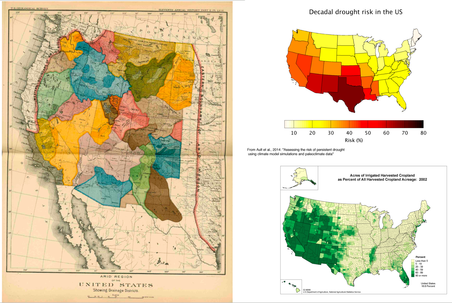
That map of the Mississippi is only midway through Brownstein’s epic post about John Wesley Powell, the “one-armed explorer of western states,” to make the point that, well, the west is dry dry dry. Powell’s surveys and this 1890 Arid Lands map in a place with less than 20” of annual rainfall should have guided a new relationship to land. Sadly, he was ignored and the rest is history. But not history; it’s current: record droughts, wildfire is now a whole season, and Phoenix has designs on the world’s largest, most expensive desalination plant down in Mexico and a 200-mile pipeline through the delicate ecosystem of the Sonoran Desert, just so people can have green lawns.

BTW, that very long and never boring post includes a consideration of the paintings of Thomas Moran and Alfred Bierstadt, which, can I get an amen? Their paintings keep me going back to the National Gallery whenever I can to gaze at them in awe.
As compelling as these maps are, their grand scale can feel abstract and distancing. That’s why it’s always a thrill to see the StoryMaps my students create for their local watersheds. Especially the ways they choose to document how they’ve engaged directly with the stream or waterbody closest to their home. More on that soon.
What watershed do you live in? Are you game to explore it further, starting next week?
https://www.epa.gov/waterdata/hows-my-waterway
https://native-land.ca/
http://www-personal.umich.edu/~mejn/election/2016/
He revisited this in a 2014 New York Times article and stood by it all.
https://www.epa.gov/eco-research/ecoregions-north-america
https://dabrownstein.com/2016/09/01/the-arid-region-of-the-united-states-and-its-after-life/
Walden is dense in places, but even then it’s worth working through. My first reading of it showed me, as an 18 year-old high school graduate, how Ill-educated I was. To get through it that first time, I bought a dictionary of mythology, because I really wanted to know what the guy living in a cabin by a pond had to say. I turned my resolve up to high and waded my way through it.
For me, the book showed a way to think about how to live. Instead of pushing a barn and 40 acres through life, or a new Volvo and a condo in a rat race, I took Thoreau’s advice to live free from encumbrances. Following his advice to live simply allowed me to see the world, do a good kind of work, and know I always had a home to go back to where I could find peace.
When my career ended (a good career doesn’t mean an easy career; there can be a price to pay), I returned home to the house I built with my own hands by a river where I found solace and healing.
I never grew many beans, though.
During the 10 years when I traveled internationally about 250 days per year, whenever I visited a new country, I often waited until I got there before I read everything I took with me about a place. It was my way of becoming unjaded about the world and I loved seeing a place fresh, with clean eyes and an open mind. The first document I always opened was a map or atlas of the country. Where were the borders and the border crossings? What was the terrain? Where did the majority of the people live? What work did they do? After a certain amount of time and travel, my mind had fewer blank pages about a place; there were always little scribbles and notes in there from other trips to borderlands and nearby countries, but I never grew tired of exploring new places.
Maps and atlases are such great tools, but some are better than others. The little country of Malawi, in southeast Africa, produced the best national atlas I ever used. (The National Atlas of Malawi. https://a.co/d/3XWZgg4). Before my ten years of constant travel, we lived almost 10 years in southern Africa, and as the chief of party for an aid agency, I used that Malawi atlas so much I wore out my first one, so I bought another which I still own. It had maps of everything: watersheds, literacy rates, mother-child mortality rates, vegetation, religions, terrain, political boundaries, agriculture, everything I wanted to know. I quickly discovered that the lowest mother-child mortality rates corresponded with areas with the highest female literacy rates, which corresponded with the areas where Scottish missionaries established mission schools early on during the colonial era. Those areas also tended to be located in places with higher altitudes. It allowed us to target our work where the needs were greatest, which did not enjoy the same advantages.
I never learned how or why Malawi came to produce such an excellent atlas, but it was a national treasure.
Also, I am waiting with great anticipation for Walden. I don’t remember if it was my third or fourth time through the book that my reading went from work to pleasure. I eventually read all his books and essays, including much of the huge two volume edition of his journals, but I left some sections alone, just so I have something to look forward to.